Business Goal: Create a premium, clean portfolio that highlights the photographer’s brand, strengthens professional credibility, and increases the number of client inquiries.
Competitor Analysis
I analyzed international fashion photographer portfolios. All the visited websites had a very minimalistic design. The main difference was in the layout systems: playfulness appears mostly in the layout, while the overall design remains clean. When the layout was too playful or creative in an uncommon way, it gave frustration during usage. Therefore, it is better to use something familiar and moderate uncommon, so the design frames the photos rather than competing with them.
I also noticed that photographers typically show photos in a moderate size. This can help prevent stealing in a high-quality picture they made. It was also common to use only black, white and grey colors—creating a “museum feeling”.
Target Audience
The primary target audience includes fashion brands, styling agencies, and magazine editors. This audience has limited time and scans content quickly. Their decisions are mainly based on visuals and references. Therefore, fast navigation and strong visual focus for the photos were key priorities.
Information Architecture
The structure was designed so that users can quickly get an overview of the client’s work on the homepage. From there, the full content of each album is accessible within a single click. The goal was to minimize decision points. Therefore, I decided on: Home, About, Contact.
The process started with low-fidelity wireframes focusing on layout structure based on the competitor analysis and previous observations. I tested several layout approaches to find which one matched the client’s vision.
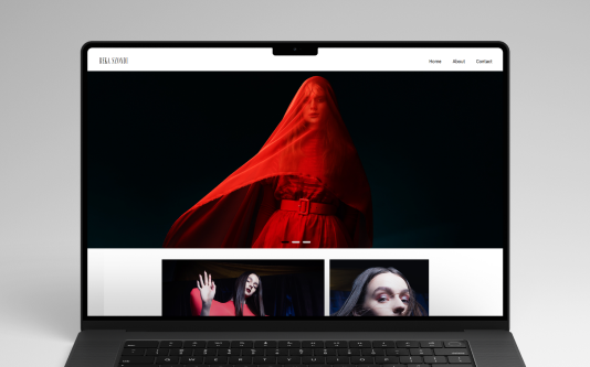
The winning home layout included a hero section where, in fullscreen sizes, a few pictures are presented in a carousel-style viewing. Underneath, the photo layout style is repeated asymmetrically. Without the carousel section, the page felt too much like Instagram. With it, we achieved a more premium editorial feel.
From the home side, users can see 2 pictures in a line from each photoshoot. Clicking opens the photo album with more pictures. In the gallery, clicking a photo lets users view it bigger.
Visual Direction
The main goal was to create a space where photographs have full attention, with a fresh, modern editorial feeling. Bigger white spaces provide a timeless aesthetic and ensure minimalistic design makes more focus on the photographer’s work.
Typography
The aim was to achieve a clean editorial atmosphere, therefore a sans-serif typeface was selected.
Grid System
On desktop, a two-column asymmetric grid was used. On mobile, the layout simplifies into a single column to ensure a better visual experience and stronger image focus on different devices.
Responsive Optimization
On mobile, the priority was fast loading and easy navigation. Therefore, the carousel gallery visible on desktop is not displayed on mobile. Instead, only photos appear, and the menu is accessible via hamburger navigation.
After the redesign, the website achieved a significantly stronger editorial feel. The average time spent on the site increased, and the number of inquiries also grew. The photographer was very satisfied with the final result.
This project reinforced that aligning functionality with the core goals is always the most important factor. Good design is often about restraint. Subtle micro-interactions and animations can significantly contribute to creating a premium feel. And as always, there is not too much space.
Képernyők & vizuális irány
Desktop wireframe, végső design és mobil élmény — hogy a portfólió minimalista maradjon, mégis prémium érzetet adjon.
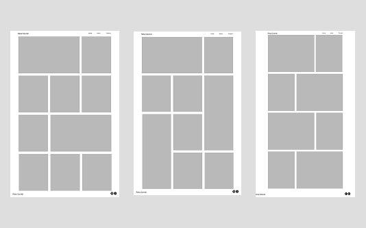
Initial layout explorations for the website structure
Editorial hangulat, letisztult rács és erős negatív tér.
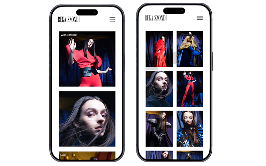
Egyszerűsített struktúra, gyors navigáció és fókusz a képeken.